Module 1: Map Design & Typography
In this lab, we learned about the five map design principles and how to utilize typography to its fullest extent. The five map design principles are visual contrast, legibility, figure-ground organization, hierarchical organization, and balance. Throughout these five maps, our was to successfully follow and implement the five map principles. We also learned about different tools and techniques for typography and how we can label different layers so they do not clash.
The following map is for the City of Austin to show tourists recreational centers and golf courses within and around the City of Austin. We focused on the basics of the five map design principles and how to implement them onto a map.
The following map is of the City of San Francisco, where we were tasked with using different methods of typography and labeling a variety of features while following the five map design principles.
The following map is of Tongass National Park and the areas that can be harvested for its timber. This map was specifically for a report that would be presented to the Timber company. With this information, I used the five map design principles to highlight the information they were focused on which were what areas could be harvested and the value of it.
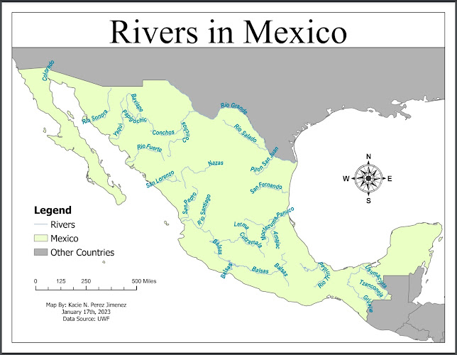
The following map is of Mexico's rivers. This map was meant to focus on typography and utilizing the different tools and methods to label intricate shapes such as rivers and to have them be legible to the viewer's eye.
The following map is of Mexico's rivers along with the capital, major cities, and states. The focus for this map was to label multiple layers so that they differentiated against one another but did not overcrowd or make the map too busy. There was some struggle with this because some labels worked well against others in one area but clashed in another. Specifically around Mexico City since there was multiple features
being labeled. Since some layers were more important than others then the labeling was deduced down to what was more important being labeled first.
being labeled. Since some layers were more important than others then the labeling was deduced down to what was more important being labeled first.


Comments
Post a Comment